
If there is one word that describes Bobbi Brown’s website, it has to be simplistic. The high-end cosmetic company has integrated the use of two bold colors, black and white, both lying on the extremes of the color spectrum.The combination is even more crucial because it underscores the broad range of diverse colors in makeup. The use of sharp and potent typography adds depth, saturates and enhances the user experience and makes the website seem lucid and customer friendly.
The website is systematic and methodical. The home page is mostly black white, with a dash of pastel colors in the frames, only to add zest and youthfulness. ‘BOBBI BROWN’ is written in bold and aligned to the center of the page and navigates the user back to the home page, making it easy to browse through the website. The website is designed for touch, mostly for the sake of mobile and tablet users. The company has also released an App on Behance for its customers wanting to purchase makeup using their smartphones.
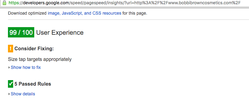
I wasn’t surprised to see the 99/100 score in terms of Bobbi Brown’s User Experience test which I did by using a Google product called Page Insights. The experience truly is extremely methodical and seamlessly easy.
There are certain noteworthy features about the website that stood out for me as a customer. There are online tutorials and makeup content available for us to peruse. This is an innovative strategy of combining content with commerce, as at the end of the video, there are certain products that the brand lures us to purchase. There is a live chat option with sales assistants, who also have makeup expertise and in addition to the live chat, customers can email makeup artists for clarifications and make-up application help. There is also a click to call button, which makes the company even more approachable and accessible for its consumers. What I also liked about the website was that as a customer, one can checkout without signing up for newsletters and not be inundated by a plethora of daily, unwanted emails. There is also a site search option available, which helps expedite the whole shopping experience and helps convert quicker. The home page also provides an interactive permutation and combination of the product choices one could choose from.
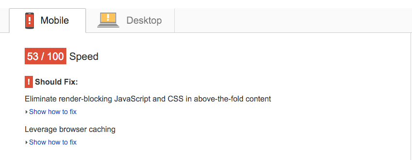
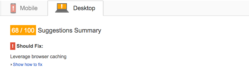
There were however, some important flaws that I would want to mention. The website lacks personalization. The design is not as visually appealing or innovative as it uses a mundane format, with no detailed visuals. I am also concerned about whether the brand is able to communicate its story to the customers. If I was to remove the label of the website, I couldn’t tell it is Bobbi Brown’s website, which to me is a profound objective of any company – to be able to recognize the brand without the label on it. In terms of functionality, I was disappointed to see the speed of the website on Page Insights for both Mobile and desktop users.
Hence I believe, in terms of functionality, the brand has done a terrific job to make the website across all media an enjoyable experience but the brand lacks in storytelling, as it is not able to create the exhilarating thrill and sheer happiness that I experience when I enter its store on Fifth Avenue. The brand needs a little more exuberance, cheer and liveliness to be able to communicate its brand appeal better.
